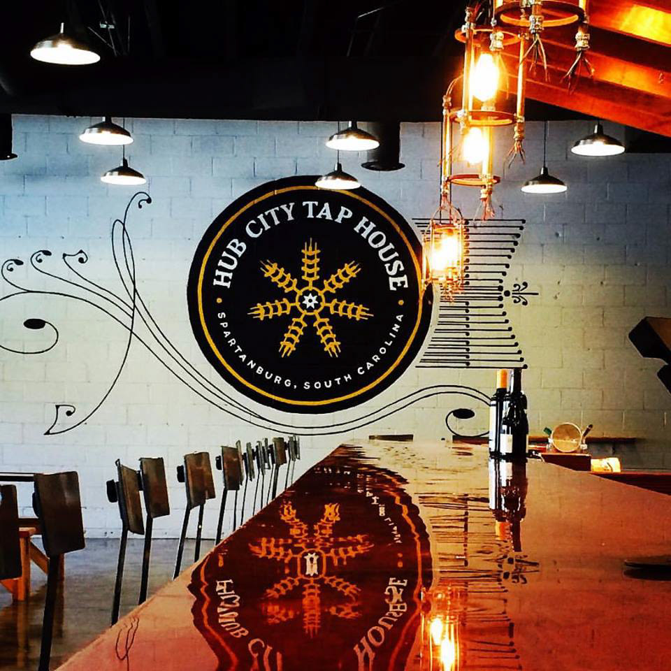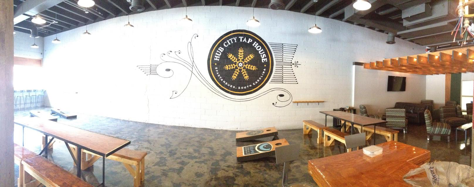


We based both the indoor and outdoor signage of Spartanburg’s Hub City Tap House on imagery and text sourced from the early 20th century. For the interior, we painted their preexisting logo, which is based on the city’s history as a railroading epicenter. We organically framed this logo with line work inspired by the beautiful flowing ornamentation used heavily by the Sanborn Map Company from 1884 through the early 1930s. For the exterior signage and face of the Tap House’s business, we selected the Appleton font. This particular typeface is brilliantly designed to encapsulate the 1880- 1910 era, when local market economies were beginning to switch to mass distribution operations with help from the American railway system. The text itself reflects the typography that was quickly becoming commonplace on the labels of shipped goods with the ongoing accessibility and affordability of color lithography. Artists Aimee Wise and Robin Schwartzman joined our painting team for each of these two projects.


